Archive for the ‘Visual Communications’ Category


Revamp and new pics

Friday, December 5th, 2008

Alright, so i updated to fonts on this and added a couple new ideas for website header pics. The fonts used are Copperplate Gothic Light for the titles and Stewardson for the text. I hope those are common fonts or people will just see Times New Roman and Arial.


Possible new site design

Friday, November 21st, 2008

Old: This one.

New:


Music and Me

Friday, November 7th, 2008

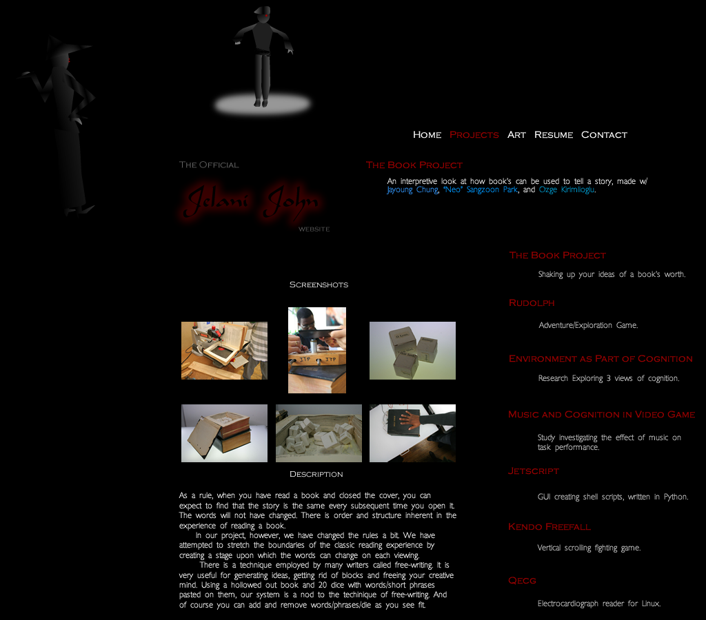
So the topic this week was to choose some aspect of my life and visualize it. I think the hardest part was just choosing something. I wanted to do something that would matter to me. So… what happens alot in my life right now?

  • Books
  • Music
  • Food
  • Sleep

Yea, so I looked at my bookshelf, started counting. Got to around 300 and said No.
Food and sleep I just don’t remember to write stuff like that down. So music it is.

So, I guess I can finally give a straight answer when people ask what music I
listen to. Unknown.

Genre


Artists


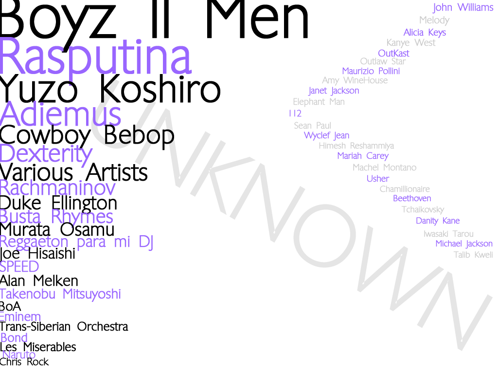
Also, though I don’t really care for them much… here’s a couple wordables of all the data.

I used an the Mp3tag editor to generate and export the data i needed (cause w/ 5900 mp3′s you do not wanna do this by hand) and did a quicky program in processing to proccess all that data. (ooh, a pun!) Code is below.
(more…)

slightly revamped business cards

Thursday, October 30th, 2008

So here are the deigns i finally decided on.


And here are the rejected ones along the way:


business card designs

Monday, October 20th, 2008

Perhaps one of these two for a front and my website inset bevel in the back.


Front A


Front B


Back

color blox

Thursday, October 16th, 2008

Latest viscomm assignment:
6 complementary color blocks, 3 analagous color blocks, picture background color choice.


Todo: Fix the css for the gallery code.

~look at all the pretty colors~

Thursday, October 9th, 2008

Examples of different color schemes in websites.

I got a 22 on my color score. Meh.

I used randomwebsite to find all of these.

Eastbay Express as Monochrome.
Cexx – as Analogous. (Also, from personal experience, I’d recommend this as a very useful website for web security.)
Red/Green as Complementary.
Raaga as Triad. Wee, its more like tetra but… wow sites like these are hard to find. (good music though. i’ve used this site before.)
Isole as ???. Red white and black. Where does it fall in the scheme of things? Monochrome?

logologologologologol

Wednesday, October 1st, 2008

Here’s my own logo design for ITP. It was kind of inspired by the style of Herb Lubalin, whose families and mother & child logos personify one or a few leters.

I think the P is a bit off.


However, out of the logos I saw, my favorite was Michael Peter’s(OBE) Nabarro logo pictured below. He’s been a designer for over 35 years and has received numerous awards and distinctions. Unfortunately, other than this logo, nothing else of his really caught my eye.

TyceFape

Wednesday, September 24th, 2008

Typefaces and wordplay.


Analyst

Friday, September 19th, 2008

Websites analyzed for organization, consistency, color, and typography. I choose Cooks.com.
They have a consistent color scheme: Green and white. Not sure why they chose it, but it looks nice. They only have 1 or 2 typeface that they use for the most part, though their weblogo is different.
The organization is in a clear, grid hierarchy. This can be seen here . Click on the picture to see the grid breakdown.


My only concern is that it looks as if they try to cram too much on the page.