

It’s been a long road. For the short version of this post, click here.
My groupmates for this project were: Jayoung Chung, “Neo” Sangzoon Park, and Ozge Kirimlioglu.
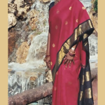
First, the results
It’s been a long road. For the short version of this post, click here.
My groupmates for this project were: Jayoung Chung, “Neo” Sangzoon Park, and Ozge Kirimlioglu.
Perhaps one of these two for a front and my website inset bevel in the back.
Front A

Front B

Back

made w/ Diego Rioja and Angela Chen
Latest viscomm assignment:
6 complementary color blocks, 3 analagous color blocks, picture background color choice.


Jayoung, Neo, Ozge and I (henceforth refered to as the Gibbering Rulers of Über People a.k.a. “the Group”), came up with an idea to create a random free-write-style word generator.
I spent a bit of last night testing stuff out with a small prototype and the most important thing I learned was this. It’s hard to flip dice. It’s easy to make a ball roll. This startling and amazing revelation will surely shock and astonish the rest of the Group as well (we’ve been stuck on this cube idea for a bit now). I shall surely let them know tomorrow.

For our comm-lab assignment, I worked w/ Jason Rosado.
And here it is:

Examples of different color schemes in websites.
I got a 22 on my color score. Meh.
I used randomwebsite to find all of these.
Eastbay Express as Monochrome.
Cexx – as Analogous. (Also, from personal experience, I’d recommend this as a very useful website for web security.)
Red/Green as Complementary.
Raaga as Triad. Wee, its more like tetra but… wow sites like these are hard to find. (good music though. i’ve used this site before.)
Isole as ???. Red white and black. Where does it fall in the scheme of things? Monochrome?
… and neither does a picture. Or something like that.
So my first time into processing and… i kinda like it. My only gripe is it’s name. I dare you to go to google and look do a casual search for code using the name “processing.” Go ahead. I’ll wait.
Anyhoo, here’s my etch-a-sketch.
Here’s my own logo design for ITP. It was kind of inspired by the style of Herb Lubalin, whose families and mother & child logos personify one or a few leters.
![]()
![]()
I think the P is a bit off.
However, out of the logos I saw, my favorite was Michael Peter’s(OBE) Nabarro logo pictured below. He’s been a designer for over 35 years and has received numerous awards and distinctions. Unfortunately, other than this logo, nothing else of his really caught my eye.
![]()
OK! Unloading the old noggin again.